The Task
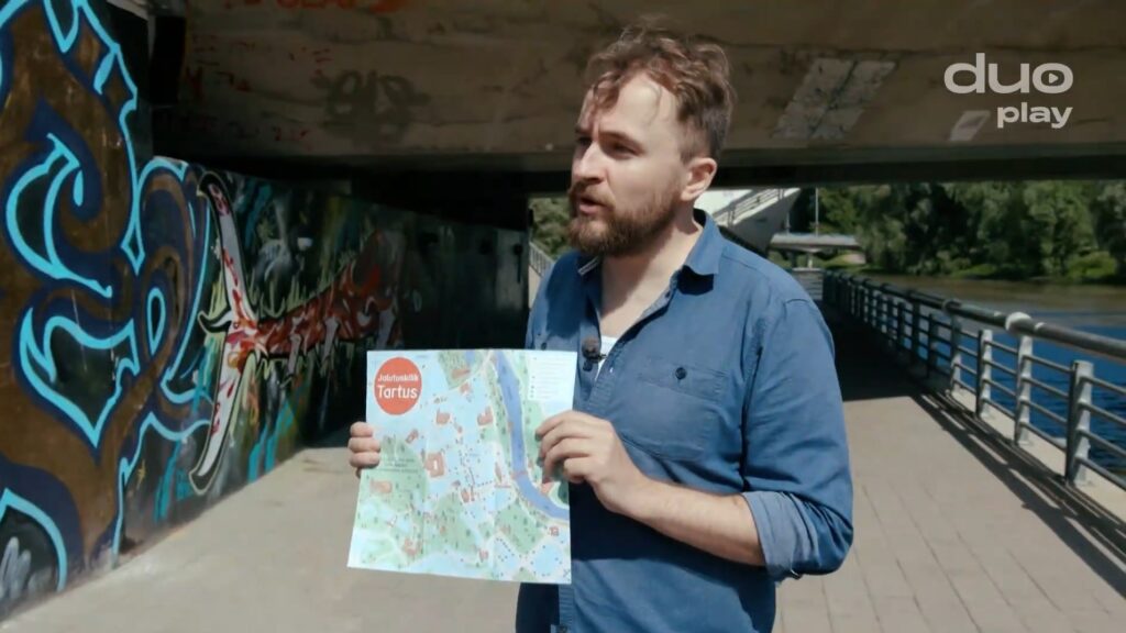
👉 The new “A Walk in Tartu’/”Jalutuskäik Tartus” free map, illustrated and designed by @sketchingpaas, with texts written by Visit Tartu is now available at Tartu Visitor Centre at Tartu Town Hall.
Mapping Tartu has been a special interest of mine for some time (see, for example, ‘How to Tartu’), so when Visit Tartu contacted me to get my offer for creating an illustrated map for a walking tour, I was very much willing to embark on this journey.
The task felt special. The map was to be compact in format – a folded A3 -, yet accommodate information about around 150 objects. All were to be made more vibrant with my illustrations and packaged in the colors of Tartu CVI. A lot of good challenges!
The Outcome
124 clocked working hours (that’s 16 full workdays), and an amount of unclocked background pondering later – the map was illustrated, designed, and handed over to the printer:
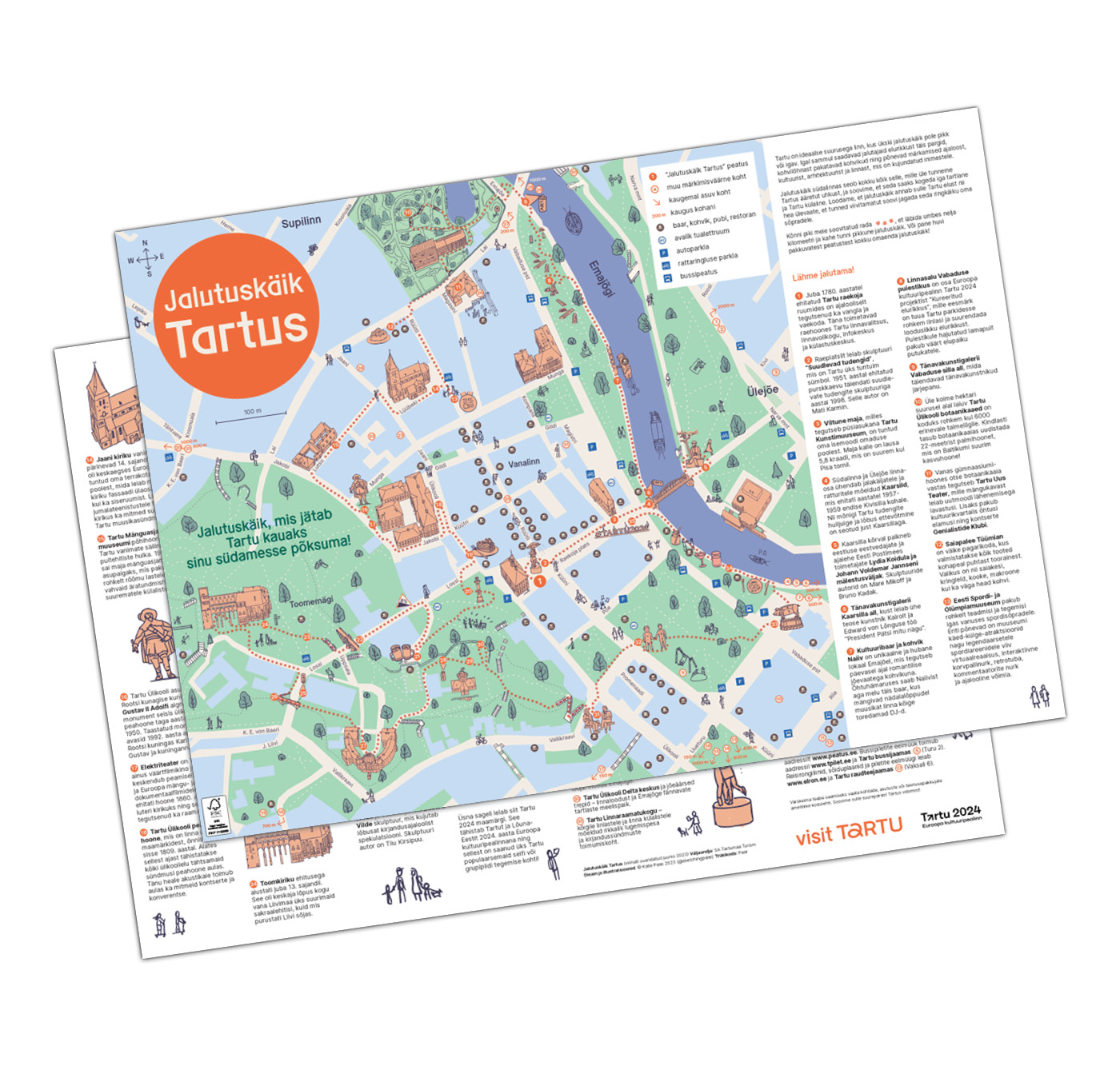
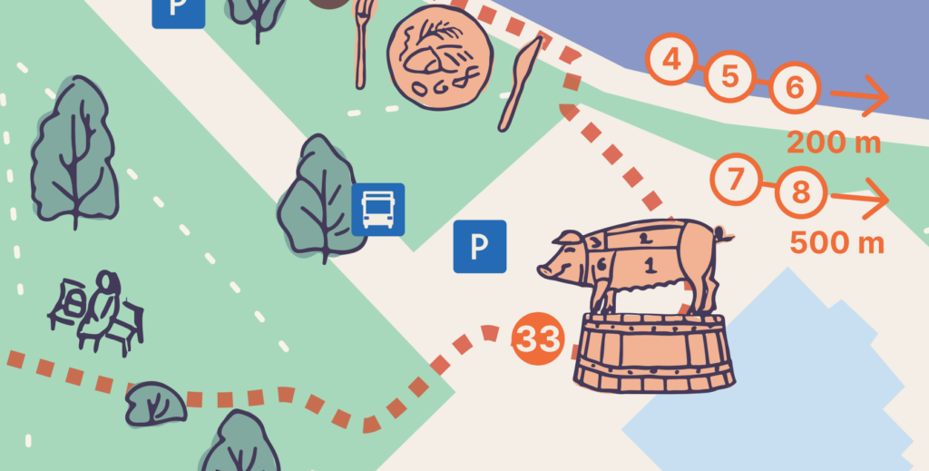
The map consists of many layers of arranged information. What probably catches the user’s eye right after the big red title are the drawn objects – buildings, sculptures, and, in some cases, food – that illustrate the map’s main route. If you wish, have a closer look at them:
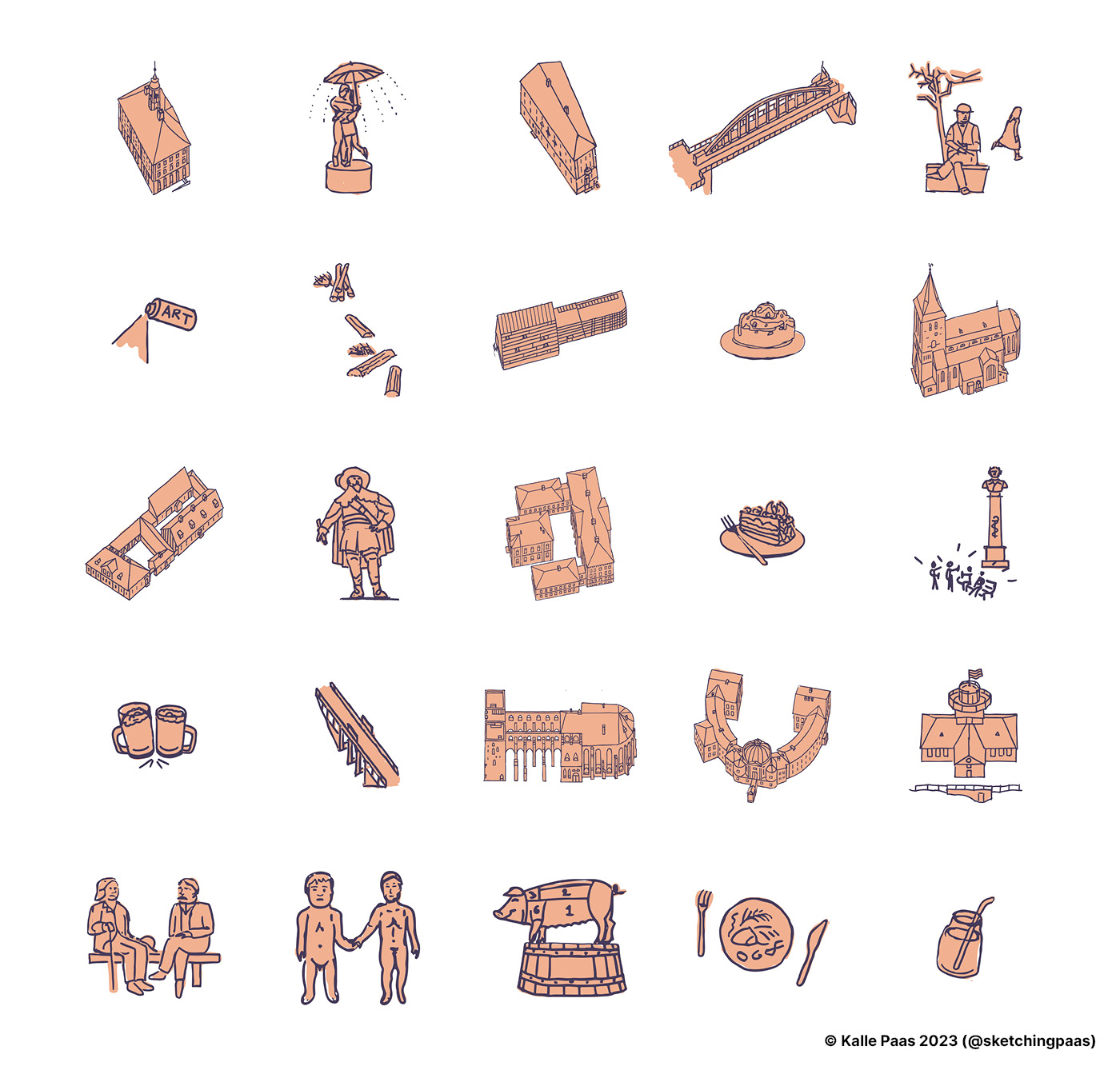
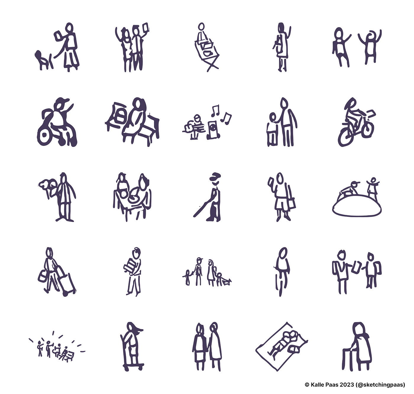
Additionally, I sketched a number of Tartuvians – and visitors of Tartu – to balance all these inanimate objects with playful human presence. Drawing and refining all these objects took a lot of time, but it was just one of the challenges of this project. Before and in parallel to drawing, I worked on a number of other design aspects that shaped the usability of ‘A Walk in Tartu’.
The Process and the Challenges
1. How to deliver the main UX qualities of a map
I approached creating the map with a lot of user experience related respect. One of the most essential UX/UI principles that I learned at VOCO during my previous year’s studies: I should stick to design conventions — because conventional usability is what people expect. And if anything, maps constitute an age-old product, with deep-rooted user expectations that have to be respected.
Therefore, I did not start designing the map by looking to invent new things, but asked myself many times: what are the conventional things that must be present?
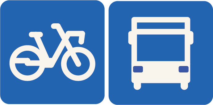
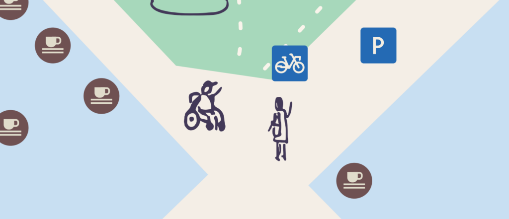
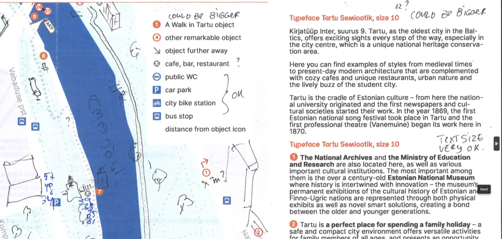
For example, the markings on the map should be universally understandable for users of different ages, capabilities, and backgrounds. The icons for public toilets, bus stops, cafes, and stops on the main route should be understandable even before consulting with the legend of the map. And even though I drew the bike and bus icons based on the actual vehicles used here, these icons should also look like any decent bike share station or bus stop pictogram.
The orientation, scale, and scope of the map should also be quickly understandable. I did make an early sketch as if the viewer was looking at the map from the West, but it served to prove that the default opinion, view from the South, was a better choice.
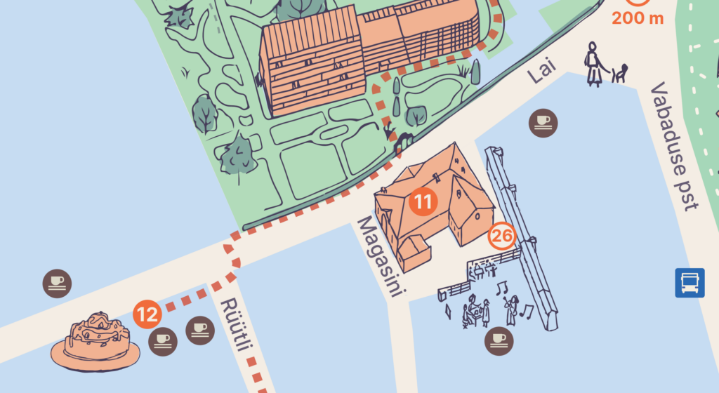
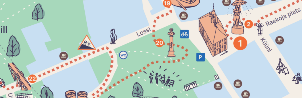
Also, safety is a top UX quality. I summed it up so that the walking tour path marked on the map should correspond to real life, steer its user clear of wasteful misunderstandings and dead ends, and promote safe behavior. For example, here I lead the user to cross Lai Street in the correct and safe way. Not at a random place, but exactly where there actually is the pedestrian crossing because the car traffic is outstandingly aggressive over there.
2. How to adapt the colors of Tartu CVI
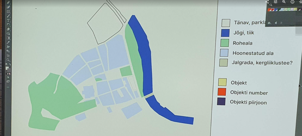
The CVI of a city does present a number of colors to choose from. In Tartu’s case, they are also named in a manner that’s appetizing for a map maker: Ülejõe blue, Tammelinna green, Veeriku purple, etc, are all named after the city’s districts!
What are the main qualities users need from such a map? Analyzing the map as a product I picked the following with the Visit Tartu team as the base for my subsequent choices: the users want to scribble on the map, and therefore its streets, parks, and buildings need to be in light colors.
Why? We can imagine a number of user stories:
- A Tartu Visitor Centre employee who wants to recommend to a tourist a sight – say, a street art gallery – by drawing a circle around it on the map.
- A conference organizer who wants to mark for a delegate the location of a cafe with a great vegetarian menu. Like Pierre with their daily vegetarian specials.
- Or a family with a baby in a stroller, who wants to omit a number of recommended stops on Toome Hill, and draw a shorter path on the map.
Red is the color associated with Tartu the most, and it’s an energetic color. So it was an obvious choice for the main title, as well as for marking the main walking route of this adventurous map.
Yet coloring all the drawn objects, numbers, and paths with the official Tartu red would have made the map strikingly intense. That’s why I used tints of the Tartu red as well as tints of some other main colors to retain the visual connectedness between similar things but make it all look and feel lighter.
3. How to fit all this information
Should such a map be striking? Striking, I think, yes. Strikingly intense? In most cases, no.
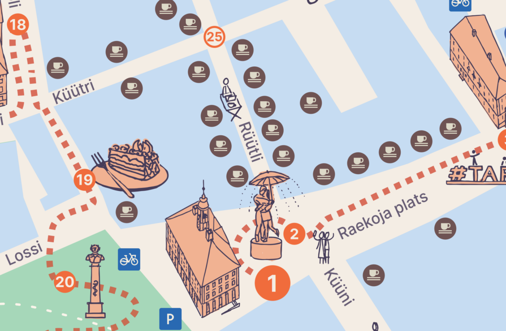
Maps are often very info heavy. The map area of ‘A Walk in Tartu’ is the size of a usual desktop monitor, yet it accommodates around 150 numbered icons or pictograms, plus drawn landmarks, people, and trees – in over 250 objects more.

It also has zigzagging colored areas with dark borders for streets, buildings, greenery, and water. There are some texts, street and neighborhood names. And there is the dashed red walking tour path that runs beside or above all of this…
This amount of objects stems from the task given to me by the client, so I had to figure out how to fit them all in a usable manner. There was potential for going over the top with intensity, but I feel the final outcome, especially in the printed form, is rather clear and pleasant to look at and use.
To put it shortly, my first step was to look at a number of different maps to understand the limits of tourist comfort (which is much different than the limits of human abilities). Some tourist maps exceed these limits, by having too complex graphical elements, too much text in too small font size, colors too similar or too contrasty, etc.
Next, I drew, designed, and layouted some of the input information to get an initial understanding of the relationships between the amount of information and the space available. Based on what I saw, I chose the smallest comfortably usable sizes (and related complexity) for objects and information, taking into account the priority of different information. I gave more space and intensity for the main route information, while additional recommendations and extra information got less.

Another conscious choice was to create the layout based on the English language as information in English takes up more space. If all the information fits into the available space in English, then it also fits in Estonian. You can blame the Estonian language for being very difficult to learn, but at least it is around 5% shorter than English!
Based on these tests and decisions, I could give the Visit Tartu team precise character limits so that they could write and edit the descriptive texts to nicely match the available space.
4. How to give accessibility cues
Not all of Tartu is accessible. A number of physical, but also informational and attitudinal obstructions disallow people’s access to places, services, and activities. Getting to not only indoor but also outdoor locations like Toome Hill can be impossible or very challenging for some visitors. Like the people who use some sort of mobility aid – either because of a disability or in the form of a baby stroller.
At the same time, I see that the map’s design should inform people about possible challenges, but not stop them from trying to go to places open to the general public. Everyone’s capabilities and available help differ. So as the designer of this map, I tasked myself to let people know what they should consider.
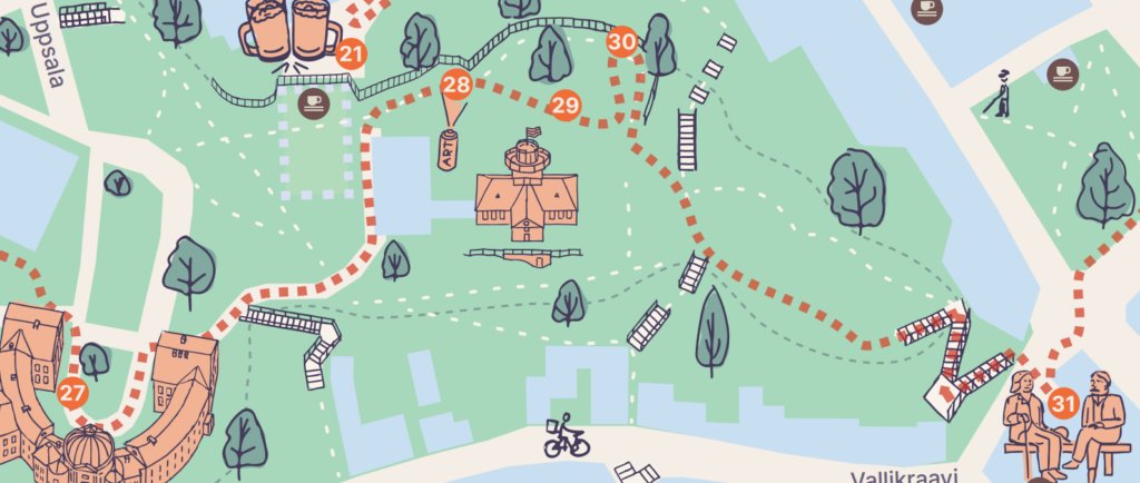
Take this case of Toome Hill: it has only one paved street, Lossi, leading to the top of it from the city center. The street’s ascent is 8%, and it’s 300 meters long. That’s okay for a car, but challenging for many people. Other options for pedestrians to get to the top of the hill are either even steeper stairs or unpaved walkways.
I checked the regulations and practices on wheelchair ramps. In usual conditions, the ramp’s ascent can be only up to 6%. Therefore, the only road that takes to Toome Hill, is most likely too steep and long for an individual in an unmotorized, or even in a motorized wheelchair. Yet, I’ve seen wheelchairs, as well as baby strollers being pushed up the hill. So some groups of people can and want to do it.
Therefore, I chose to warn the map users with a standard traffic sign that communicates the slope’s 8% grade. Alternately, I considered using topographic contour lines or drawn hillsides, but these options did not seem to inform the user as clearly and they certainly brought along much more visual noise.
Another case with Toome Hill: stairs to and from it are usually steep, and probably too inconvenient or impassable for a family with a stroller, for people with reduced mobility, etc. My choice as the illustrator was to show clearly that the walking tour path leads through stairs. Again, I hope it helps the users make conscious decisions: they either avoid this part of the route or accept the physical effort they have to make.
A question for the future: should/could the specific accessibility information about each main route object also be on the map? As of now, the map asks the visitor to check the respective home pages because accessibility info is not standardized and each object is a different story.
5. How to test the map
‘A Walk in Tartu’/”Jalutuskäik Tartus” will be used by thousands of people who will spend thousands of hours holding these maps in their hands. To make their user experience as pleasant as possible, it was a must to test the map continuously in all design stages before it was printed.
First, I tested it myself. Every once in a while during the design process, I printed out the latest map. Holding it in my hands as another user, I pondered over its usability.
Then I got feedback from the project team members – people from Visit Tartu and Tartu City Government. I got confirmations, questions, and propositions from presenting and discussing the map with the project team as well as with my family.
Then we had external test users. The map was put on trial by people like the visiting friends of Visit Tartu’s foreign intern, students from Ukraine, or well-traveled locals. These people provided feedback on the map’s design and user experience in various stages of the project.
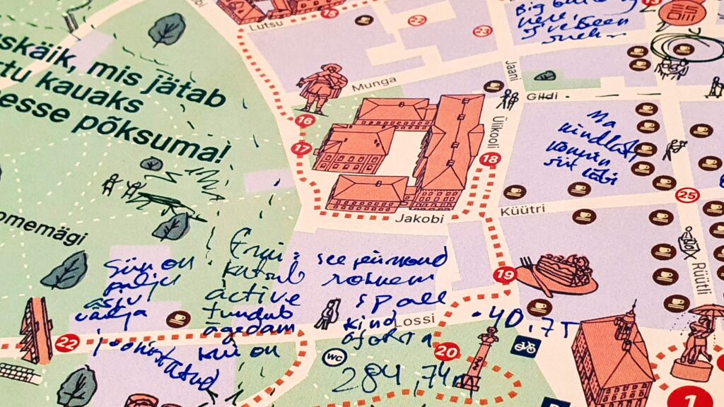
I feel we did a decent job designing the map based on people’s feedback. Yet, by publishing the map, we did not finish but just restarted collecting useful feedback from the users. In an anecdotal tale, only two days after the map was sent to print, one friend of mine, a professionally educated map user, pointed out one obvious, and easily avoidable text placement issue that had not been reported by anyone so far. Nothing critical, but very telling!
I’m sure this and possibly other issues raised by the users will be addressed in future iterations of the ‘Walk in Tartu’ map. As well as that I will apply these super-valuable experiences and insights when designing my next map projects.
Thank you for reading this article! If you happen to use the ‘A Walk in Tartu’/”Jalutuskäik Tartus” map, please let me know how did it go!
🙌 I thank the Visit Tartu team for the vision for this project, for the trust, and for all this hard (team) work they put into it!
🤗 Big thanks to all the English and Estonian test users who tried out, feedbacked, and validated the emerging map. Especially big thanks to Alina Paas for being there for me, and listening to all of my ramblings about the ongoing design and drawing processes, Tartu, and life.